CMF: How Products Feel Now!
Why Color, Material, and Finish Matter More Than Ever
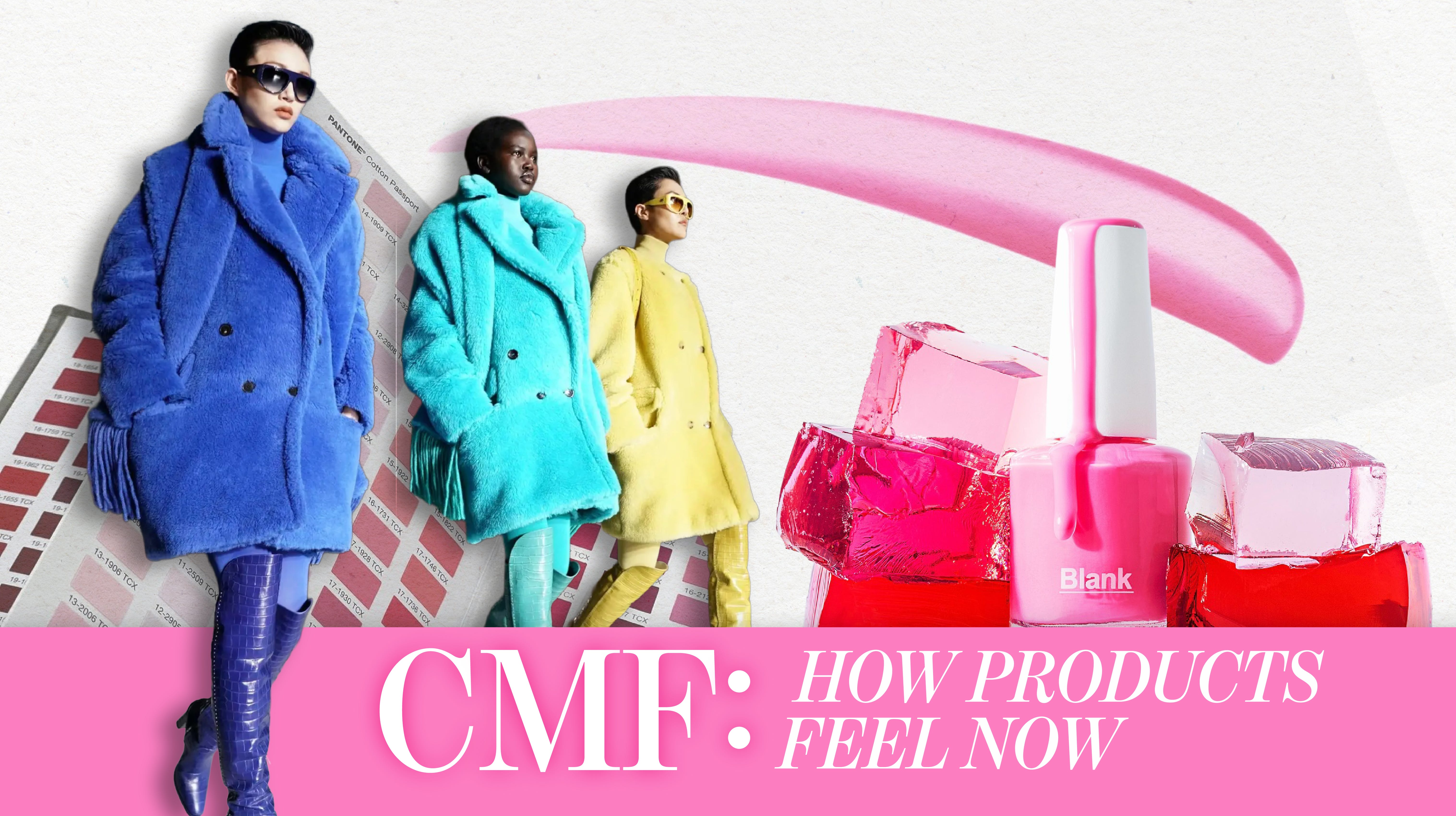
This week at Gingergeist, we’re digging into CMF: Color, Material, Finish, the foundational design language behind how products look, feel, and connect with consumers. We’re starting with color because it’s often the most immediate and emotionally charged. The “building brick” of all designs, so to speak!
Color: The Emotional Signal
Pantone has announced its Color of the Year, Cloud Dancer, and there’s already been plenty of thoughtful commentary around it, so we’ll let others wax eloquent on that. What we’re more interested in is why color continues to hold such outsized power!
Color is emotional, cultural, and instantly legible. It works across every price point and category, including fashion, home, beauty, and beyond. Behind that immediacy is real work: long sessions in light boxes, spectrophotometers, endless lab dips, palette reviews, and careful decisions about consistency, cost, and timing.
At its core, color is systems thinking. It’s about building coherent palettes, balancing core shades with accents, and understanding how collections evolve season to season. When does newness enter? What anchors the range? How do colors speak to one another across a line or an environment? Any offbeat combinations that can elevate basics? These decisions rarely live in isolation.
For a broader view of how color became a shared global language, we recommend the documentary The King of Color, which traces Larry Herbert, inventor of the Pantone Matching System. Filmmaker Patrick Creadon, discusses how the Pantone Matching System transformed subjective color into an industry-wide standard.
At the most granular level, this work can also be pure fun. We’ve spent plenty of time naming nail polish shades and cosmetic colors, debating whether something leans plum or berry, cinnamon or vicuña, aqua or “it’s giving Las Vegas hotel pool at 7 a.m., BEFORE sunscreen.” We’re two creators who’ve learned from some of the best in the world of color and can easily generate 40 nuanced names for what most people would call the same shade of butter yellow. Laying out palettes and samples and chasing nuance is obsessive, yes, but joyful too.
If you want to go deeper on color, we highly recommend following our friends at The Taste Curators. Abbey and Lish explore the intersection of color, flavor, and culture in a way that consistently reminds us how sensory choices carry meaning, memory, and emotion!
Material: Where Emotion Becomes Physical
If color is the emotional signal, material is where that emotion becomes physical. Color draws us in, but material determines how long we stay and whether the promise holds up in real life. Which brings us to M in CMF: material. Suddenly, everything is coming up soft and cozy!
Retail searches and social media data indicate a rise in cozy accents and textile enhancements. Etsy’s Marketplace Insights notes the rise of cozy living, with searches on the platform containing “cozy room decor” up 96% YoY. TikTok can also be seen driving the trend as a measure of comforting armor against daily life. Popular callouts include “Minky,” chenille, fleece/sherpa, sueded scuba, and faux furs. These plush materials are being featured in ASMR and sensory videos (where creators focus on tactile experiences for relaxation), DIY and craft tutorials (global searches for “textured blanket” have increased 21% according to Google Trends), and fashion hauls and outfit styling.
From a materials perspective, shaggy and high-pile fabrics are re-emerging as winter staples, driven by advances in softness, density, and handfeel rather than by novelty alone. What began as a comfort-forward texture in kids’ apparel has expanded into adult categories, with exaggerated pile, minky-like finishes, chenille constructions, and faux-fur alternatives now read as intentional and elevated. The success of earlier teddy textures paved the way, but today’s iterations are lighter, more controlled, and often engineered for better drape and durability.
European brands, particularly in Scandinavia, are helping legitimize the material through restrained silhouettes and neutral palettes that let texture carry the visual weight. Ongoing social traction around terms like #minkyfabric, #chenilleyarn, #softfabrics, #floofy, #sensory, #texturedfabrics, and #fauxfur points to continued momentum.
Finish: Jelly Interpreted
In CMF, finish is where design becomes experiential. It shapes how something feels, reflects light, and invites touch. Right now, jelly textures stand out as one of the most compelling finish stories. Jelly finishes are tactile, translucent, and visually playful. They signal softness, bounce, and lightness, offering an alternative to rigid matte or high-gloss surfaces. In beauty, this shows up in jelly blushes, sheer lip and cheek products, and bouncy, gel-like textures that melt into skin and move naturally with it.
Nails offer a clear signal of jelly’s broader appeal. Jelly nail finishes lean into translucence and gloss, creating a candy-like, layered effect that feels both nostalgic and modern. Built-up color, visible depth, and easy layering reinforce jelly as a finish that prioritizes feel and flexibility over precision.
What makes jelly especially powerful is its ability to function as a finish language, not just a beauty trend. It translates seamlessly into adjacent categories:
Skincare, through gel creams, water jellies, and cushiony textures
Nails, via translucent color, jelly gloss, and buildable depth
Packaging, where soft translucency and bounce communicate freshness and approachability
Home and lifestyle, through lighting, decor objects, and materials that emphasize softness and glow
Food and fragrance adjacencies, where jelly cues nostalgia, pleasure, and sensory play
As consumers continue to prioritize feel, tactility, and emotional resonance, jelly finishes offer a flexible, cross-category way to express modern softness. Finish here is not just surface, it is experience.
Why It Matters:
Color, Material, and Finish work as a system. Color draws us in, material builds trust, and finish confirms the experience. As consumers become more attuned to how things feel, CMF has moved from decoration to strategy. It’s often the difference between a product that looks good and one that feels right! CMF isn’t just aesthetic. It’s connection!


The color naming section hit different. The casual mention of generating 40 names for basically the same butter yellow really captures how granular color work actually is. I've been in similiar discussions for product launches where the differnce between "warm sand" and "desert beige" somehow mattered to market positioning. The vicuña reference is perfecttoo, it signals luxury without being obvious about it. Nice how the piece connects that obsessive color work to the broader CMF framework, showing it's not just aesthetic nerdery but actually strategic differentiation.